
There are a huge amount of datasets available online, you can find many on https://dataportals.org/ including data for the city of New York. They provide a dataset containing details on over 1.8 million crashes.
Plotting the data#
Now each crash contains a Latitude and Longitude value for where the collision occurred. And with 1.8 million collisions, it should be possible to map New York roads using this data.
Step 1, Load the Data#
Download the dataset above, load it in via pandas.
# %% Import the Dataset, assumed in subfolder# datasets/ny/Motor_Vehicle_Collisions_-_Crashes.csv
import osimport pandas as pd
DATA_PATH = os.path.join("datasets", "ny")DATA_NAME = "Motor_Vehicle_Collisions_-_Crashes.csv"
def load_data(data_path=DATA_PATH, data_name=DATA_NAME):    csv_path = os.path.join(data_path, DATA_NAME)    return pd.read_csv(csv_path)
crashdata = load_data()
Step 2, Explore the Data#
You can view the data to get a better idea of what's being shown.
# %% Data exploration
print(crashdata.head())print(crashdata.info())
# Misc injury statistics
print(crashdata.iloc[:, 10:18].sum())# NUMBER OF PERSONS INJURED        528270.0# NUMBER OF PERSONS KILLED           2492.0# NUMBER OF PEDESTRIANS INJURED     97629.0# NUMBER OF PEDESTRIANS KILLED       1283.0# NUMBER OF CYCLIST INJURED         44811.0# NUMBER OF CYCLIST KILLED            186.0# NUMBER OF MOTORIST INJURED       383340.0# NUMBER OF MOTORIST KILLED          1008.0
print(crashdata.iloc[:, 10:18].max())# NUMBER OF PERSONS INJURED        43.0# NUMBER OF PERSONS KILLED          8.0# NUMBER OF PEDESTRIANS INJURED    27.0# NUMBER OF PEDESTRIANS KILLED      6.0# NUMBER OF CYCLIST INJURED         4.0# NUMBER OF CYCLIST KILLED          2.0# NUMBER OF MOTORIST INJURED       43.0# NUMBER OF MOTORIST KILLED         5.0
Step 3, Plot the data#
An initial attempt at plotting the data may be surprising to some, unsurprising to others. Not good:
subcrash = crashdata # To speed up plotting use a smaller set e.g. crashdata[:10000]
# Remove all rows where there is an invalid Longitude/Latitude valuesubcrash.dropna(subset=["LONGITUDE","LATITUDE"])
subcrash.plot(kind="scatter", x="LONGITUDE", y="LATITUDE")
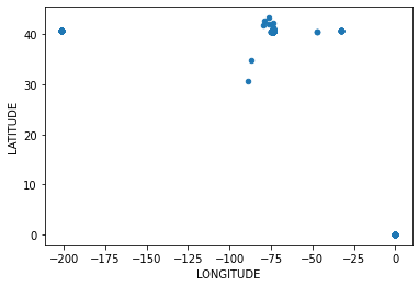
We can see that we have some zero values for Longitude and Latitude as well as perhaps some incorrectly entered values.
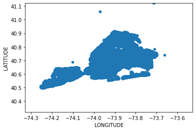
Step 4, Clean the data#
One way would be to clean the data frame, such as by filtering columns:
subcrash = subcrash[subcrash.LONGITUDE > -74.4]subcrash = subcrash[subcrash.LONGITUDE < -70]subcrash = subcrash[subcrash.LATITUDE < 41]
Or, we can make use of matplotlib's xlim and ylim setting to set our range
to view the plot with:
med = crashdata[["LONGITUDE", "LATITUDE"]].median()offset = 0.3
subcrash.plot(kind="scatter", x="LONGITUDE", y="LATITUDE", xlim=[med[0]-offset,med[0]+offset], ylim=[med[1]-offset,med[1]+offset])And for those familiar with New York might start to recognise the shape:
Step 5, Polish the graph#
Now, matplotlib let's you set opacity for the scatter plot as well as the size of the dots.
subcrash.plot(kind="scatter", x="LONGITUDE", y="LATITUDE", alpha=0.01, s=0.02, xlim=[med[0]-offset,med[0]+offset], ylim=[med[1]-offset,med[1]+offset])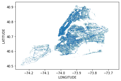
Now that's more like a map of New York.
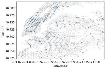
Bonus pictures#
And zoomed in even more, you can clearly see Central Park and the iconic Manhattan roads:
Source code avaiable at https://github.com/richhaar/newyork-crash-map.
Bonus picture of New York, definitely worth a visit.